Showing posts with label Projects. Show all posts

Tuesday, September 23, 2014

A Vintage Tub + Modern Shower = A Swanky New Bathroom


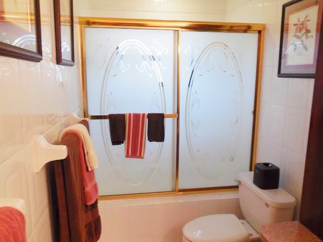
This little gem of a guest bathroom belongs to my dearest clients Pat and Oscar B, clients whose home we have spent years renovating room by room. This bathroom once looked like this:


Sure it had been functional over the years and offered loads of storage, but after we'd tackled every other room in the house included here and here it was time to finally work some magic on this space. We had noticed issues with this bathroom long before i.e. a leak through the tile into the adjoining master bedroom, which came as no surprise when we opened the wall and discovered that the crew who had built this bathroom had been drinking up a storm on the job. A shocking yet hilarious discovery, though we are thankful they remained sober enough to complete the job. Anywho, as you can see, the challenge with this space is it's a very long bathroom (12 ft) but very narrow (5 ft). You can see peeks of the demolition here and here.


Pat had always wanted a vintage styled tub, but Oscar also wanted to maintain a shower so the challenge was merging those two requests. To accommodate both wishes, we would need to take 12" of space from the adjoining master bedroom to widen the bathroom a bit and give the tub a little elbow room.

The wave tile and accent tile, which kinda mimics the movement of bubbles, were the easiest selections made for this project! That stylish grab bar to the left serves as wash cloth holder now, but will prove more functional over the years for added ease in and out of the tub.


The shower and overflow/splashes from the tub would need to share a drain, so we decided to do this with a special integrated drain system that blended well into the tile. Since there would be no shower ledge to separate the shower doors from the rest of the bathroom floor, the floors had to be perfectly pitched so water would never seep into the adjoining space. Translation: the plumber and tile installer must work in harmony to make this a flawless installation.

 
We relocated the toilet to right to gain additional space for the shower, since there was plenty of room to the right to do so. Since this was a guest bathroom, we decided a 36" floating vanity would offer just enough storage for guest essentials.  


Since we replaced the original door with a pocket door (of course I did!) we now have extra room in this cozy corner for a little stool/table or for a basket for guests to toss used towels.  


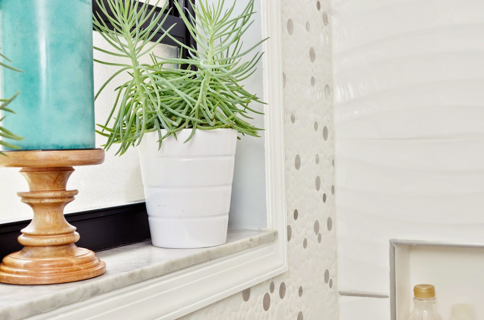
Psst.  Y'all know how I feel about fake plants and flowers so of course these were removed on day one of demolition!
We also used an integrated medicine cabinet to provide additional storage within the walls, without compromising the contemporary feel of the space.

 
Pat is an orchid lover, so we added new matting and re-framed her original orchid prints.  

Yes, that's a television in the bathroom. Our clients love to stay connected so I think there's a television in just about every room of this house. And that's it folks. One of the most technically challenging bathrooms of my career, and one that was even more complicated as we worked through the design and plumbing challenges with my clients while they were on vacation in South Africa. But I think it's safe to say they are happy with the way our final project (well, sort of) for this home has turned out. A huge thanks to Pat and Oscar for being major supporters of NWD and we're eternally grateful for their continuous stream of referrals.  


Source Guide
 

Main Tile  and Accent wall USA Tile and Marble I Faucet, Tub Filler, Hand Held Shower: Ferguson | Tub: Wayfair I Artwork: Clients Original | Medicine Cabinet: Signature Hardware | Floating Vanity: Wayfair; alternative vanity:eFauets.comI Lighting: Lumens


Thursday, August 28, 2014

A Kitchen Renovation That Sold a Home


This kitchen once belonged to one of our favorite clients. After five years of discussing and dreaming up this kitchen design we renovated it earlier this year and then guess what? They decided to sell their home. Of course all our hearts ached, but they have since moved into a much larger and rather beautiful home and we'll be renovating that kitchen as well.

I did a horrible job and failed to take real before photos so these few images are all we have to show how far the kitchen had come. But I think y'all get the picture? Dated cabinets, an unnecessary bulkhead and so much more. I did post a few pics to Instagram as well here and here and yes, my client even chipped in on demo day. 


Goodbye and hello.

We updated to white shaker style cabinets, white quartz countertops, then added some contrast with glass tiles for the backsplash. 

The existing gas range and dishwasher were in great shape so those remained but a new refrigerator and hood were purchased.

New sink, simple faucet and a nice view made this little corner a cozy place to stand and peek outside while doing the dishes.

We removed the wall separating the kitchen from the dining room and created a small seating area. For added contrast, the lower cabinets here were done in a cinnamon colored shaker style finish.

This area also housed a wine cooler and added storage for wines and glassware.


 An awkward door once separated the laundry room from the kitchen and while we often prefer to keep the laundry room separate, it just made for easier flow to remove the door and add similar cabinets and countertops above the washer and dryer for folding and sorting laundry.


And that's it folks. Our very first kitchen renovation of the year and we've been told that the kitchen sealed the deal for the new owners. Hip, hip, hooray for that. 
It's been a year of the kitchens, and we'll have more reveals to show over the next few months.
Sorry to be so MIA over here but we've just been slammed with projects, which of course is a wonderful blessing.  I'll be catching up on my blog reading this weekend to see how y'all have been doing.Cheers to a great Labor Day weekend!

Wednesday, May 21, 2014

The Hollywood Reveal - Living Room/Foyer


So I'm still recovering from my big 40 birthday celebration which involved dinner made by two of my favorite foodie crushes, chefs Nina Compton and Shirley Chung, finalists from last season's Top Chef. If you've followed me here or on IG you know that I'm a foodie at heart, so major kudos to the  hubby for such an amazing treat, and to Xavier for showering me with happy birthday tunes and kisses all weekend.
Speaking of treats, one of my favorite projects of the year has been designing the winter home of my clients Karen and Carl.
They purchased this South Florida home to escape the harsh winters of the Northeast. Just a short walk from the beach, it was a great find for them both to squeeze in some quality time as a couple, yet large enough to welcome family and friends who too craved some Florida warmth.
When Karen contacted me in January the living room looked like this:
 
They had brought this VERY heavy sleeper sofa from their home in Maryland, but it looked so sad and lonely in this massive space and Karen was simply stumped. She was also a tad worried because a dozen women from her book club, plus family members were slated for back-to-back visits in early March. That's right. Roughly six weeks to design the main living areas of this five bedroom home, plus the master bedroom. 
You'll remember the presentation we made in this post and how frantic I was when trying to pull said presentation together here and here.
It was a daunting task that also involved refinishing the ceilings, painting all the rooms, changing out all the interior and exterior doors, updating all the lighting. Let's just say we sweated bullets as we prayed that custom items would be ready on time.
  This is what the living room looks like today. Neutral tones with the bold pops of color Karen yearned for. 
Some background:
Karen is one of those clients that I connected with immediately. I mean, the kind of client you hug on the first meeting and miss terribly when the project is over. A kindred spirit, she often marveled how I read her mind as I would often source items she had considered for herself or already owned in her Maryland home. It was a joy to shop with her on our various excursions because she had a clear sense of her style and would fall head over heels in love with an item, or knew and told me right away if her heart didn't skip a beat and we'd move on.
From our initial consultation I learned that she loved orange and purple and wanted them both throughout the space but was nervous that the two bold colors would stage an unholy war if paired together. I think we proved that the two can live very happily together.


The Cole chairs in purple, were a delicious treat we found at Wassers Furniture. A great South Florida resource for designers, as they can customize almost anything with a variety of fabric options and can expedite orders - which we kinda needed since we didn't have the luxury of the usual 8 to 16 weeks custom orders can often take.
This super sized and comfy sofa from KOM Furniture seats many and was the perfect balance for the purple accent chairs. Throw pillows from my favorites Home Goods and Z Gallerie were budget-friendly finds.
I envisioned a mammoth coffee table that was a little rough on the edges and this Beijing coffee table from my long-time fave Addison House was the perfect find. You can seat an army around that table, and they did!

This diver was a nod to Karen who grew up at the Jersey Shore and went to the beach here everyday. It was one of the first things she spotted during the reveal and fell hopelessly in love with.

We wanted lots of light to filter in so wanted window treatments that made a statement of their own but simply framed the windows. This Kravet fabric was a splurge, but oh so worth it. 

This woven leather chair, also from Addison, is sooooooooo comfy and became Karen's favorite chair to chill in. It's delivery was down to the wire - pun intended. 


In such a large room, it was important to create little vignettes throughout for moments of pause. This mirrored chest offered both storage and just a touch of glamor and its reflective surface helped bounce light around the room.
Karen loves African ancestral pieces, and I fell in love with this tribal vest from KOM and knew it would tell its own tale in their home.


Lets slide over to the entryway shall we?


Karen scored these very statuesque pieces, who fit perfectly at the entryway. An over-sized mirror reflects more light and draws the outdoors in. The scroll bench is a place for Karen to sit for a minute before she headed out to the beach and provides additional seating for guests. 


The new frosted doors along the entryway and all along the very long hallway add some architectural interest and a modern touch. The buffet once sat all alone in the dining room, but I knew the minute I first saw it that it needed to hold court here instead.

 We added the x leg ottomans for extra seating.
These lamps from Overstock made my heart sing and definitely hold court atop the buffet/console, right next to their new BFF, the giraffe I snagged at Home Goods.
Photo Credit - Circle Ten Media
Fresh colors are a must in every home, and I was pleased as punch that tulips were in bloom for this reveal. But yes, it's okay to cheat with "other" florals when you're like Karen and not in your home for much of the year.  I promise I won't talk smack.
That's all folks. For now. We'll check out the rest of their home over the next few weeks because it's a lot to share! 
I might add, that Karen and Carl were a designers dream. They were clear about their vision but gave me plenty of room to execute said vision. They're back home for the summer and I've truly missed our daily emails and calls! Looking forward to updating the guest rooms and baths next year and to seeing them both when I visit DC this summer. 
             

Source Guide
Sofa, Tribal Vest and Diving Sculpture: Kom Furniture | Purple Accent Chairs: Wassers Furniture | Coffee Table and Woven Leather Chair: Addison House | Rug: Gilt | Mirrored Chest: City Furniture | Curtain Fabric: Kravet/Eeva pattern via Designer Discount Fabric | Living Room Lamps, throw pillows and accent storage boxes: Home Goods | Foyer Art and Orange Throw Pillows: Z Gallerie | Cow Hide Rug in Entry: Ikea | Copper Lamps:Overstock | Gold and White Tray: Target | Foyer Buffet/Console: Scan Design | X-Leg Benches: Overstock | Frosted Interior Doors: Sheridan Lumber | Floor Mirror: City Furniture | Frosted Gold End Tables: Wayfair | Foyer Bench: Shop NWD |Living Room Paint: Chop Sticks by Sherwin Williams (SW 7575) | Foyer Paint: Copper Wire by Sherwin Williams ( SW 7707)

Thursday, April 24, 2014

Reveal Day: A Model Unit Design = Dream Realized - Part 2

 When potential residents walk into the model unit of this Miami apartment complex, I wanted them to feel energized, jolted by a room that felt colorful, playful, cheeky yet welcoming. 
  And boy would they need a jolt, because just like the bedrooms we revealed here earlier this week, all the walls were painted beige and had to remain that way. 


 The Smarty Pants artwork kinda set the tone in this living room and should appeal to the student/young professional demographic the owners attract in this complex.  An apartment sized sofa (always search for those in a tight space - trust me on this), two fun patterned chairs (which can serve double duty at the dining table) with a stool/end table sandwiched in between + two stools at the bar = seating for eight.


The key was here was to highlight the fact that even though the living space is small, there could be ample seating for a student with a lot of friends or for a young family. 


Since we couldn't paint the walls, we added color via the curtains - a combination of blues and orange to again evoke the colorful and lively feel of Miami. We balanced that color by using a grey sofa, black rug and loads of white via coffee table, bar stools and lamps. 

 I fell in love with these throw pillows from CB2 - love that place - which added some more color and fun. 
 
I love a layered coffee table, no matter how small. This table packs a punch with color, cute accessories and function - a tray, vase for fresh flowers and candle holders for those nights they want to have a little romantic setting.


 There's only one ceiling fan with a light for both the living and dining rooms, so additional lighting was a must. These cute lamps from Target in white helped balance the bold colors in the space.
 
 In the entryway, we needed a media console high enough to place keys/mail as you entered but one that could also store media equipment. This buffet from El Dorado furniture was a great find - and we scored it on sale - had to stay in that budget!


The dining room was next. Oh how I fought to replace that ceiling fan. I lost, which meant I needed to do everything possible to make it disappear.

A round table would create a better flow and ease of movement from the entryway and can seat five if needed.
Inexpensive pop art can be easily rotated on this picture ledge.
For more casual dining, residents can grab a seat at the kitchen peninsula on these adjustable bar stools.


Where they can now peek into a kitchen that's been loaded up with fun essentials.
 

All photos by Circle Ten Media

What time is it? Time to be grateful says this wall. I couldn't agree more. Definitely had a blast designing this unit and learned a lot about designing a space that needed to appeal to many different kinds of residents. Huge thanks to Debbie who worked overtime to help pull this one together from beginning to end. And to Shaggy, who as y'all know, wears many, many hats on the NWD team. Yep, kinda grateful. 

Sources:
Dining Table - Ikea

Ghost Chairs - Lexington Modern
Sofa - City Furniture
Coffee Table - TargetEnd Tables - Target
Lamps - Target
Patchwork Chairs - Overstock
Media Console - El Dorado Furniture
Living Room Rug: Overstock
Dining Room Rug: HomeGoods
Throw Pillows: CB2 and Target
Curtains: Custom design by Nicole White Designs; Workroom - Titan Decor
Artwork: Etsy and Art.com; custom framing by Frame Art Miami


Blog Design by Get Polished